This article needs additional citations for verification. Please help improve this article by adding citations to reliable sources. Unsourced material may be challenged and removed. Find sources: "Scatter plot" – news · newspapers · books · scholar · JSTOR(April 2024) (Learn how and when to remove this message)
Plot using the dispersal of scattered dots to show the relationship between variables
Not to be confused with Correlogram or Scatter matrix.
Scatter plot
One of the Seven Basic Tools of Quality
First described by
John Herschel
Purpose
To identify the type of relationship (if any) between two quantitative variables
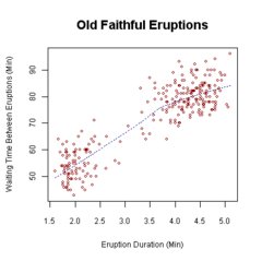
Waiting time between eruptions and the duration of the eruption for the Old Faithful Geyser in Yellowstone National Park, Wyoming, USA. This chart suggests there are generally two types of eruptions: short-wait-short-duration, and long-wait-long-duration.A 3D scatter plot allows the visualization of multivariate data. This scatter plot takes multiple scalar variables and uses them for different axes in phase space. The different variables are combined to form coordinates in the phase space and they are displayed using glyphs and coloured using another scalar variable.[1]
A scatter plot, also called a scatterplot, scatter graph, scatter chart, scattergram, or scatter diagram,[2] is a type of plot or mathematical diagram using Cartesian coordinates to display values for typically two variables for a set of data. If the points are coded (color/shape/size), one additional variable can be displayed.
The data are displayed as a collection of points, each having the value of one variable determining the position on the horizontal axis and the value of the other variable determining the position on the vertical axis.[3]
The first description of the scatter plot is generally attributed to John Herschel (1792–1871).[4][5]
^Visualizations that have been created with VisIt at wci.llnl.gov. Last updated: November 8, 2007.
^Jarrell, Stephen B. (1994). Basic Statistics (Special pre-publication ed.). Dubuque, Iowa: Wm. C. Brown Pub. p. 492. ISBN 978-0-697-21595-6. When we search for a relationship between two quantitative variables, a standard graph of the available data pairs (X,Y), called a scatter diagram, frequently helps...
^Utts, Jessica M. Seeing Through Statistics 3rd Edition, Thomson Brooks/Cole, 2005, pp 166-167. ISBN 0-534-39402-7
^Friendly, Michael; Denis, Dan (2005). "The early origins and development of the scatterplot". Journal of the History of the Behavioral Sciences. 41 (2): 103–130. doi:10.1002/jhbs.20078. PMID 15812820.
A scatterplot, also called a scatterplot, scatter graph, scatter chart, scattergram, or scatter diagram, is a type of plot or mathematical diagram using...
In descriptive statistics, a box plot or boxplot is a method for demonstrating graphically the locality, spread and skewness groups of numerical data through...
or a one-dimensional scatterplot. Rug plots are often used in combination with two-dimensional scatterplots by placing a rug plot of the x values of the...
A violin plot is a statistical graphic for comparing probability distributions. It is similar to a box plot, with the addition of a rotated kernel density...
Karl Pearson. A scatterplot is a mathematical diagram that uses Cartesian coordinates to display values of a dataset. A scatterplot shows the data as...
It is a basic type of chart common in many fields. It is similar to a scatterplot except that the measurement points are ordered (typically by their x-axis...
multivariate statistics, a scree plot is a line plot of the eigenvalues of factors or principal components in an analysis. The scree plot is used to determine the...
other windows. GeoDa also is capable of producing histograms, box plots, Scatterplots to conduct simple exploratory analyses of the data. The most important...
line chart or scatterplot may be more appropriate. Bar charts of continuous data with error bars are sometimes referred to as dynamite plots. Limited use...
A funnel plot is a graph designed to check for the existence of publication bias; funnel plots are commonly used in systematic reviews and meta-analyses...
embedded device Scatterplot, a type of diagram Scattered (disambiguation) This disambiguation page lists articles associated with the title Scatter. If an internal...
star chart, star plot, cobweb chart, irregular polygon, polar chart, or Kiviat diagram. It is equivalent to a parallel coordinates plot, with the axes arranged...
performing a linear regression with a single independent variable, a scatterplot of the response variable against the independent variable provides a...
plots, adjusted variable plots, and individual coefficient plots. When performing a linear regression with a single independent variable, a scatter plot...
visualization such as auxiliary plots, images of experimental data, project logos, etc. Scatterplot: VisIt's Scatterplot allows visualizing multivariate...
of these points (with their multiples) forms a radiating line in the scatterplot to the right. Additionally, these are the remaining primitive Pythagorean...
Plotly is a technical computing company headquartered in Montreal, Quebec, that develops online data analytics and visualization tools. Plotly provides...
omitted data remove information from which to base a conclusion. In the scatterplot with missing categories on the left, the growth appears to be more linear...
 Global Information