 Global Information
Data and information visualization information
This article may need to be cleaned up. It has been merged from Information visualization. |
| Part of a series on Statistics |
| Data and information visualization |
|---|
| Major dimensions |
|
| Important figures |
|
| Information graphic types |
|
| Related topics |
|
 |
| Information mapping |
|---|
| Topics and fields |
|
| Node–link approaches |
|
| See also |
|
Data and information visualization (data viz/vis or info viz/vis)[2] is the practice of designing and creating easy-to-communicate and easy-to-understand graphic or visual representations of a large amount[3] of complex quantitative and qualitative data and information with the help of static, dynamic or interactive visual items. Typically based on data and information collected from a certain domain of expertise, these visualizations are intended for a broader audience to help them visually explore and discover, quickly understand, interpret and gain important insights into otherwise difficult-to-identify structures, relationships, correlations, local and global patterns, trends, variations, constancy, clusters, outliers and unusual groupings within data (exploratory visualization).[4][5][6] When intended for the general public (mass communication) to convey a concise version of known, specific information in a clear and engaging manner (presentational or explanatory visualization),[4] it is typically called information graphics.
Data visualization is concerned with visually presenting sets of primarily quantitative raw data in a schematic form. The visual formats used in data visualization include tables, charts and graphs (e.g. pie charts, bar charts, line charts, area charts, cone charts, pyramid charts, donut charts, histograms, spectrograms, cohort charts, waterfall charts, funnel charts, bullet graphs, etc.), diagrams, plots (e.g. scatter plots, distribution plots, box-and-whisker plots), geospatial maps (such as proportional symbol maps, choropleth maps, isopleth maps and heat maps), figures, correlation matrices, percentage gauges, etc., which sometimes can be combined in a dashboard.
Information visualization, on the other hand, deals with multiple, large-scale and complicated datasets which contain quantitative (numerical) data as well as qualitative (non-numerical, i.e. verbal or graphical) and primarily abstract information and its goal is to add value to raw data, improve the viewers' comprehension, reinforce their cognition and help them derive insights and make decisions as they navigate and interact with the computer-supported graphical display. Visual tools used in information visualization include maps (such as tree maps), animations, infographics, Sankey diagrams, flow charts, network diagrams, semantic networks, entity-relationship diagrams, venn diagrams, timelines, mind maps, etc.
Emerging technologies like virtual, augmented and mixed reality have the potential to make information visualization more immersive, intuitive, interactive and easily manipulable and thus enhance the user's visual perception and cognition.[7] In data and information visualization, the goal is to graphically present and explore abstract, non-physical and non-spatial data collected from databases, information systems, file systems, documents, business and financial data, etc. (presentational and exploratory visualization) which is different from the field of scientific visualization, where the goal is to render realistic images based on physical and spatial scientific data to confirm or reject hypotheses (confirmatory visualization).[8]
Effective data visualization is properly sourced, contextualized, simple and uncluttered. The underlying data is accurate and up-to-date to make sure that insights are reliable. Graphical items are well-chosen for the given datasets and aesthetically appealing, with shapes, colors and other visual elements used deliberately in a meaningful and non-distracting manner. The visuals are accompanied by supporting texts (labels and titles). These verbal and graphical components complement each other to ensure clear, quick and memorable understanding. Effective information visualization is aware of the needs and concerns and the level of expertise of the target audience, deliberately guiding them to the intended conclusion.[9][3] Such effective visualization can be used not only for conveying specialized, complex, big data-driven ideas to a wider group of non-technical audience in a visually appealing, engaging and accessible manner, but also to domain experts and executives for making decisions, monitoring performance, generating new ideas and stimulating research.[9][4] In addition, data scientists, data analysts and data mining specialists use data visualization to check the quality of data, find errors, unusual gaps and missing values in data, clean data, explore the structures and features of data and assess outputs of data-driven models.[4] In business, data and information visualization can constitute a part of data storytelling, where they are paired with a coherent narrative structure or storyline to contextualize the analyzed data and communicate the insights gained from analyzing the data clearly and memorably with the goal of convincing the audience into making a decision or taking an action in order to create business value.[3][10] This can be contrasted with the field of statistical graphics, where complex statistical data are communicated graphically in an accurate and precise manner among researchers and analysts with statistical expertise to help them perform exploratory data analysis or to convey the results of such analyses, where visual appeal, capturing attention to a certain issue and storytelling are not as important.[11]
The field of data and information visualization is of interdisciplinary nature as it incorporates principles found in the disciplines of descriptive statistics (as early as the 18th century),[12] visual communication, graphic design, cognitive science and, more recently, interactive computer graphics and human-computer interaction.[13] Since effective visualization requires design skills, statistical skills and computing skills, it is argued by authors such as Gershon and Page that it is both an art and a science.[14] The neighboring field of visual analytics marries statistical data analysis, data and information visualization and human analytical reasoning through interactive visual interfaces to help human users reach conclusions, gain actionable insights and make informed decisions which are otherwise difficult for computers to do.
Research into how people read and misread various types of visualizations is helping to determine what types and features of visualizations are most understandable and effective in conveying information.[15][16] On the other hand, unintentionally poor or intentionally misleading and deceptive visualizations (misinformative visualization) can function as powerful tools which disseminate misinformation, manipulate public perception and divert public opinion toward a certain agenda.[17] Thus data visualization literacy has become an important component of data and information literacy in the information age akin to the roles played by textual, mathematical and visual literacy in the past.[18]
- ^ Corbett, John. "Charles Joseph Minard: Mapping Napoleon's March, 1861". Center for Spatially Integrated Social Science. Archived from the original on 19 June 2003. (CSISS website has moved; use archive link for article)
- ^ Shewan, Dan (5 October 2016). "Data is Beautiful: 7 Data Visualization Tools for Digital Marketers". Business2Community. Archived from the original on 12 November 2016.
- ^ a b c Nussbaumer Knaflic, Cole (2 November 2015). Storytelling with Data: A Data Visualization Guide for Business Professionals. John Wiley & Sons. ISBN 978-1-119-00225-3.
- ^ a b c d Antony Unwin (31 January 2020). "Why Is Data Visualization Important? What Is Important in Data Visualization?". Harvard Data Science Review. 2 (1). doi:10.1162/99608f92.8ae4d525. Retrieved 27 March 2023.
- ^ Ananda Mitra (2018), "Managing and Visualizing Unstructured Big Data", Encyclopedia of Information Science and Technology (4th ed.), IGI Global
- ^ Bhuvanendra Putchala; Lasya Sreevidya Kanala; Devi Prasanna Donepudi; Hari Kishan Kondaveeti (2023), "Applications of Big Data Analytics in Healthcare Informatics", in Narasimha Rao Vajjhala; Philip Eappen (eds.), Health Informatics and Patient Safety in Times of Crisis, IGI Global, pp. 175–194
- ^ Olshannikova, Ekaterina; Ometov, Aleksandr; Koucheryavy, Yevgeny; Ollson, Thomas (2015), "Visualizing Big Data with augmented and virtual reality: challenges and research agenda.", Journal of Big Data, 2 (22), doi:10.1186/s40537-015-0031-2
- ^ Card, Mackinlay, and Shneiderman (1999), Readings in Information Visualization: Using Vision to Think, Morgan Kaufmann, pp. 6–7
{{citation}}: CS1 maint: multiple names: authors list (link) - ^ a b "What is data visualization?". IBM. Retrieved 27 March 2023.
- ^ Brent Dykes (2019), Effective Data Storytelling: How to Drive Change with Data, Narrative and Visuals, John Wiley & Sons, p. 16
- ^ David C. LeBlanc (2004), Statistics: Concepts and Applications for Science, Jones & Bartlett Learning, p. 35–36
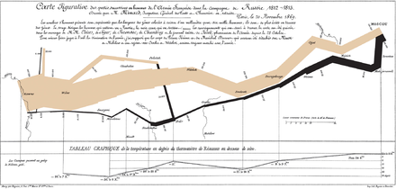
- ^ Grandjean, Martin (2022). "Data Visualization for History". Handbook of Digital Public History: 291–300. doi:10.1515/9783110430295-024. ISBN 9783110430295.
- ^ E.H. Chi (2013), A Framework for Visualizing Information, Springer Science & Business Media, p. xxiii
- ^ Gershon, Nahum; Page, Ward (1 August 2001). "What storytelling can do for information visualization". Communications of the ACM. 44 (8): 31–37. doi:10.1145/381641.381653. S2CID 7666107.
- ^ Mason, Betsy (November 12, 2019). "Why scientists need to be better at data visualization". Knowable Magazine. doi:10.1146/knowable-110919-1.
- ^ O'Donoghue, Seán I.; Baldi, Benedetta Frida; Clark, Susan J.; Darling, Aaron E.; Hogan, James M.; Kaur, Sandeep; Maier-Hein, Lena; McCarthy, Davis J.; Moore, William J.; Stenau, Esther; Swedlow, Jason R.; Vuong, Jenny; Procter, James B. (2018-07-20). "Visualization of Biomedical Data". Annual Review of Biomedical Data Science. 1 (1): 275–304. doi:10.1146/annurev-biodatasci-080917-013424. hdl:10453/125943. S2CID 199591321. Retrieved 25 June 2021.
- ^ Leo Yu-Ho Lo; Ayush Gupta; Kento Shigyo; Aoyu Wu; Enrico Bertini; Huamin Qu, Misinformed by Visualization: What Do We Learn From Misinformative Visualizations?
- ^ Börner, K.; Bueckle, A.; Ginda, M. (2019), "Data visualization literacy: Definitions, conceptual frameworks, exercises, and assessments", Proceedings of the National Academy of Sciences, 116 (6): 1857–1864, Bibcode:2019PNAS..116.1857B, doi:10.1073/pnas.1807180116, PMC 6369751, PMID 30718386