For the country referred to as the same name in Latin, see Switzerland.
For other uses, see Helvetica (disambiguation).
Not to be confused with Helvetia, the national personification of Switzerland.
Helvetica
Category
Sans-serif
Classification
Neo-grotesque[1]
Designer(s)
Max Miedinger Eduard Hoffmann
Foundry
Haas'sche Schriftgiesserei (Basel)
Date released
1957
Re-issuing foundries
Mergenthaler Linotype Company
Design based on
Akzidenz-Grotesk
Variations
Helvetica Inserat Helvetica Compressed Neue Helvetica Helvetica Now Others (see below)
Also known as
Neue Haas Grotesk
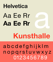
Shown here
Neue Helvetica
Metrically compatible with
Arial Arimo Liberation Sans
Helvetica, also known by its original name Neue Haas Grotesk, is a widely used sans-serif typeface developed in 1957 by Swiss typeface designer Max Miedinger and Eduard Hoffmann.
Helvetica is a neo-grotesque design, one influenced by the famous 19th-century (1890s) typeface Akzidenz-Grotesk and other German and Swiss designs.[2] Its use became a hallmark of the International Typographic Style that emerged from the work of Swiss designers in the 1950s and 1960s, becoming one of the most popular typefaces of the mid-20th century.[3] Over the years, a wide range of variants have been released in different weights, widths, and sizes, as well as matching designs for a range of non-Latin alphabets. Notable features of Helvetica as originally designed include a high x-height, the termination of strokes on horizontal or vertical lines and an unusually tight spacing between letters, which combine to give it a dense, solid appearance.
Developed by the Haas'sche Schriftgiesserei (Haas Type Foundry) of Münchenstein (Basel), Switzerland, its release was planned to match a trend: a resurgence of interest in turn-of-the-century "grotesque" sans-serifs among European graphic designers, that also saw the release of Univers by Adrian Frutiger the same year.[4][5][6] Hoffmann was the president of the Haas Type Foundry, while Miedinger was a freelance graphic designer who had formerly worked as a Haas salesman and designer.[7]
Miedinger and Hoffmann set out to create a neutral typeface that had great clarity, had no intrinsic meaning in its form, and could be used on a wide variety of signage.[7] Originally named Neue Haas Grotesk (New Haas Grotesque), it was rapidly licensed by Linotype and renamed Helvetica in 1960, which in Latin means "Swiss", from Helvetia, capitalising on Switzerland's reputation as a centre of ultra-modern graphic design.[8] A feature-length film directed by Gary Hustwit was released in 2007 to coincide with the 50th anniversary of the typeface's introduction in 1957.[9]
^Kupferschmid, Indra. "Combining Type With Helvetica". FontShop (archived). Archived from the original on 30 April 2010. Retrieved 29 April 2018.
^Berry, John. "A Neo-Grotesque Heritage". Adobe Systems. Archived from the original on 16 October 2015. Retrieved 15 October 2015.
^Shinn, Nick (2003). "The Face of Uniformity" (PDF). Graphic Exchange. Archived from the original (PDF) on 18 November 2016. Retrieved 18 July 2022.
^Kupferschmid, Indra (14 October 2014). "I had never loved Helvetica". Archived from the original on 25 October 2018. Retrieved 5 October 2015.
^Gerstner, Karl (1963). "A new basis for the old Akzidenz-Grotesk (English translation by Forgotten Shapes)" (PDF). Der Druckspiegel. Archived from the original (PDF) on 2017-10-15. Retrieved 15 October 2017.
^Gerstner, Karl (1963). "Die alte Akzidenz-Grotesk auf neuer Basis" (PDF). Der Druckspiegel. Archived from the original (PDF) on 2017-10-15. Retrieved 15 October 2017.
^ abHelvetica (Documentary). 2007-09-12.
^Shaw, Paul. "Helvetica and Univers addendum". Blue Pencil. Archived from the original on 24 September 2015. Retrieved 1 July 2015.
^Shaw, Paul. "The Univers of Helvetica: A Tale of Two Typefaces". Print. Archived from the original on 17 September 2019. Retrieved 26 June 2016.
Helvetica, also known by its original name Neue Haas Grotesk, is a widely used sans-serif typeface developed in 1957 by Swiss typeface designer Max Miedinger...
ˈʒviːtsʁɐ] (Romansh). On coins and stamps, the Latin name, Confoederatio Helvetica—frequently shortened to "Helvetia"—is used instead of the spoken languages...
character in the popular typeface Helvetica; the purpose of this design is to allow a document designed in Helvetica to be displayed and printed with the...
Natrix helvetica recognized (having been formerly classified as subspecies of N. natrix): N. helveticahelvetica (syn. N. natrix helvetica) N. helvetica cetti...
Rickettsia helvetica, previously known as the Swiss agent, is a bacterium found in Dermacentor reticulatus and other ticks, which has been implicated...
Helvetica Chimica Acta is a peer-reviewed scientific journal of chemistry established by the Swiss Chemical Society. It is published online by John Wiley...
Grotesk typeface in 1957, renamed Helvetica in 1960. Marketed as a symbol of cutting-edge Swiss technology, Helvetica achieved immediate global success...
Androsace helvetica is a plant in the family Primulaceae. Androsace helvetica is widely distributed in the Alps, where it is absent from areas with siliceous...
acceptance, some describe them as the "Helvetica" of pictograms, and the character portrayed within them as Helvetica Man. As works of the United States government...
Salix helvetica, the Swiss willow, is a scrubby willow species found in the Alps (from 1700 to 2700 m) and the Tatras portion of the western Carpathians...
especially in Switzerland. The First Helvetic Confession (Latin: Confessio Helvetica prior), known also as the Second Confession of Basel, was drawn up in...
helvetica, the barred grass snake. Four other subspecies were transferred from N. natrix to N. helvetica, becoming N. helvetica cettii, N. helvetica corsa...
Swiss neutrality is one of the main principles of Switzerland's foreign policy which dictates that Switzerland is not to be involved in armed conflicts...
francs. All coins have the legend of either Helvetia or Confœderatio Helvetica, the Latin name of the Swiss Confederation, along with the year number...
Nimbus Sans is a sans-serif typeface created by URW++, based on Helvetica. It is a version using URW++ font source. The family supports Western Europe...
more low-slung, splayed appearance than Helvetica, especially in bold. Frutiger himself has commented: "Helvetica is the jeans, and Univers the dinner jacket...
is a national personification of Switzerland, officially Confoederatio Helvetica, the Swiss Confederation. The allegory is typically pictured in a flowing...
series are placed throughout each episode, some of them adapted from Helvetica Standard, another manga by Arawi. Yūko Aioi (相生 祐子, Aioi Yūko) Voiced...
novel member of the family Methylocystaceae, transfer of Methylopila helvetica Doronina et al. 2000 to Albibacter helveticus comb. nov. and emended descriptions...
typeset the letter Q, the letter's tail may either bisect its bowl as in Helvetica, meet the bowl as in Univers, or lie completely outside the bowl as in...
masthead to a juxtaposition of an italic Garamond "The", with a bold Helvetica "Guardian", that remained in use until the 2005 redesign. In 1992, The...
exactly what a font's characteristics are, for instance "Helvetica 67" (HE67) translates to "Helvetica Bold Condensed". The first algorithmic description of...
 Global Information