Series of serif typefaces intended for use in newspapers
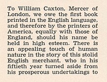
Sample of Linotype Textype, a Legibility Group typeface
The Legibility Group is a series of serif typefaces created by the American Mergenthaler Linotype Company and intended for use in newspapers on Linotype's hot metal typesetting system. They were developed in-house by Linotype's design team, led by Chauncey H. Griffith, and released from 1922, when the first member, Ionic No. 5, appeared.[1][2][3][4]
Griffith's aim with the Legibility Group typefaces was to create a design with more body than the rather spindly Didone typefaces previously standard in newspaper printing.[5] To this end, the designs have low contrast in stroke weight, wide open counters and ball terminals, intended to make the letters clearly distinguishable even when printed on poor-quality newsprint paper.
The Legibility Group typefaces were extremely popular and remained used by many newspapers worldwide throughout the metal type period and beyond; many other newspaper typefaces from other foundries such as Intertype were created based on their design. A notable exception is Monotype's Times New Roman, which was created to take advantage of the unusually high standard of printing of the Times in the 1930s.[a] In 1972, British printing manager Allen Hutt commented that "the majority of the world's newspapers are typeset in one or another of the traditional Linotype 'Legibility Group', and most of the rest in their derivatives."[1]
^ abHutt, Allen (1973). The Changing Newspaper: typographic trends in Britain and America 1622-1972 (1. publ. ed.). London: Fraser. pp. 100–2 etc. ISBN 9780900406225.
^Victor Margolin (2015). World History of Design. Bloomsbury Academic. pp. 445–6. ISBN 978-1-4725-6651-5.
^Alexander S. Lawson (January 1990). Anatomy of a Typeface. David R. Godine Publisher. pp. 277–294. ISBN 978-0-87923-333-4.
^Rotary International (January 1940). "The Rotarian". The Rotarian. Rotary International: 35–8. ISSN 0035-838X.
^ abTracy, Walter. Letters of Credit. pp. 82, 194–195.
Cite error: There are <ref group=lower-alpha> tags or {{efn}} templates on this page, but the references will not show without a {{reflist|group=lower-alpha}} template or {{notelist}} template (see the help page).
The LegibilityGroup is a series of serif typefaces created by the American Mergenthaler Linotype Company and intended for use in newspapers on Linotype's...
can affect legibility. In everyday language, legibility is commonly used as a synonym for readability. In graphic design, however, legibility is often distinguished...
typeface called Ionic, which became the first in a series known as the LegibilityGroup. These kept to the nineteenth-century model but greatly reduced the...
More Legible: Serif or Sans Serif Typefaces? alexpoole.info Archived 2010-03-06 at the Wayback Machine. Effects of Font Type on the Legibility The Effects...
printing with typewriters and on newsprint paper. For example, Linotype's LegibilityGroup, in which most newspapers were printed during much of the twentieth...
for nearly 100 years. A particularly notable success was Linotype's LegibilityGroup of typefaces, used by most of the world's (Latin-alphabet) newspapers...
readability and legibility of all caps text. Scientific testing from the 20th century onward has generally indicated that all caps text is less legible and readable...
to be used across Samsung's diverse device portfolio, with a focus on legibility for everything from smaller devices like smartphones to larger connected...
composed of opsin apoprotein covalently linked to a light-absorbing prosthetic group: either 11-cis-hydroretinal or, more rarely, 11-cis-dehydroretinal. The...
separate but related concepts. Legibility and readability tend to support aesthetic aspects of a product. Legibility describes how easily individual...
determined a running cipher of K4 that resulted in an incomplete but partially legible K4 plaintext, involving text such as "XPIST", "REALIZE", "AYD EQ HR", and...
handwriting textbook sales in the US, A Beka, Schaffer, Peterson, Loops and Groups, McDougal, Steck Vaughn, and many others. Italic Styles include Getty-Dubay...
Carrefour was ordered to pay a fine of €2 million and to prominently and legibly display a notice in all of its French stores disclosing the false advertising...
should be affixed over the edge of the visa, but without affecting the legibility of the conditions and security features of the visa if the travel document...
as well as classification system limitations. Medical record legibility The legibility of a medical record is a contributing factor in the accuracy of...
to legibility issues, for example the letters "A" and "R" were often hard to distinguish. From 2006 the font was changed again to improve legibility, and...
useful for understanding Chinese character calligraphy, ensuring character legibility. identifying fundamental components of radicals, and implementing support...
2010, a slightly darker shade of red was chosen (RAL 3003) to improve legibility. Most European countries use metal plates, however France and Ireland...
the superscript letter it modifies, e.g. ⟨ᵓ̃⟩, this can be an aid to legibility, just as it is with the composite superscript c-cedilla ⟨ᶜ̧⟩ and rhotic...
practical reasons – but simply type design choices created to optimize the legibility of the text. There have been a number of proposals to extend or replace...
countries around the world. The typefaces were developed to maximize legibility at a distance and at high speed. The typeface has 6 fonts, from narrow...
and the audience stay on track is through the incorporation of text in a legible font size and type. According to the article "Prepare and Deliver an Effective...
 Global Information